Dinàmics
Designing an inclusive wellness activity app.
Dinàmics is a concept iOS app centered on inclusivity, community, and the simple joy of finding something to do nearby. Underneath, it's a wellness product: our research showed staying active keeps people motivated and isolation at bay. One bet shaped everything: design with the people current tools exclude most, and it will work for everyone.
Dinàmics
Designing an inclusive wellness activity app.
Dinàmics is a concept iOS app centered on inclusivity, community, and the simple joy of finding something to do nearby. Underneath, it's a wellness product: our research showed staying active keeps people motivated and isolation at bay. One bet shaped everything: design with the people current tools exclude most, and it will work for everyone.
Product
iOS
Accessibility
Role
Product & Motion Designer
Timeline
Nov - Feb 2026 (4 months)
Credits



Framer is a no-code tool for building and publishing responsive websites—perfect for anyone creating modern, high-performance pages without coding.
Problem
Connection is a health issue. Access is the barrier.
In 2025, the WHO declared loneliness a global health crisis: one in six people affected, a toll it ranks alongside risks like tobacco. The groups facing the steepest barriers, older adults, migrants, people with disabilities, are exactly who mainstream activity apps serve worst.
The activities already exist; what's broken is finding them: information scattered across posters, WhatsApp groups, Instagram stories, and a pile of event apps. The gap is informational: the offer exists, but you can't tell what's for you.
Problem
Connection is a health issue. Access is the barrier.
In 2025, the WHO declared loneliness a global health crisis: one in six people affected, a toll it ranks alongside risks like tobacco. The groups facing the steepest barriers, older adults, migrants, people with disabilities, are exactly who mainstream activity apps serve worst.
The activities already exist; what's broken is finding them: information scattered across posters, WhatsApp groups, Instagram stories, and a pile of event apps. The gap is informational: the offer exists, but you can't tell what's for you.
Research
Start at the edges, design for everyone.
Inclusive design says: solve for the edges, and the middle takes care of itself. We started there: four interviews with adults over 65 in Valencia. Names changed for privacy.
"What keeps me going is that I haven't lost my spark. And when you lose your spark, you lose everything." For Rosa, activity stood between her and isolation. That idea made this a wellness product.
"I go everywhere with my friends. But if they don't go, I don't go either." For Carmen, interest wasn't the issue. Company was the gatekeeper.
"I tried zumba and I couldn't do it. But dance and theater? Those I can do, and I love them." No listing ever told Pilar what an activity would demand. She had to fail to find out.
Scattered information, needing company, unclear expectations: that's not a description of being older, it's a description of being new. I pushed to test it: two more interviews, young newcomers in Berlin. One wanted to try boxing: "I've never been to a gym and I don't know if they speak English or if I'm strong enough. I'm so shy and I don't want to be embarrassed." Same walls. The prototype we tested greeted Carmen, 80, from Valencia. The final app answers in English, ready for whoever's new in town.
Research
Start at the edges, design for everyone.
Inclusive design says: solve for the edges, and the middle takes care of itself. We started there: four interviews with adults over 65 in Valencia. Names changed for privacy.
"What keeps me going is that I haven't lost my spark. And when you lose your spark, you lose everything." For Rosa, activity stood between her and isolation. That idea made this a wellness product.
"I go everywhere with my friends. But if they don't go, I don't go either." For Carmen, interest wasn't the issue. Company was the gatekeeper.
"I tried zumba and I couldn't do it. But dance and theater? Those I can do, and I love them." No listing ever told Pilar what an activity would demand. She had to fail to find out.
Scattered information, needing company, unclear expectations: that's not a description of being older, it's a description of being new. I pushed to test it: two more interviews, young newcomers in Berlin. One wanted to try boxing: "I've never been to a gym and I don't know if they speak English or if I'm strong enough. I'm so shy and I don't want to be embarrassed." Same walls. The prototype we tested greeted Carmen, 80, from Valencia. The final app answers in English, ready for whoever's new in town.
Testing
Thirteen sessions, four with adults over 65.
Round one unmoderated with tap heatmaps, round two moderated, face to face. They validated our primary actions and showed our first onboarding ran too long, so we trimmed it. A small sample, shown unpolished below.
Testing
Thirteen sessions, four with adults over 65.
Round one unmoderated with tap heatmaps, round two moderated, face to face. They validated our primary actions and showed our first onboarding ran too long, so we trimmed it. A small sample, shown unpolished below.

First-round heatmaps on the lo-fi prototype
Decisions
Earn trust before asking for it.
Show the app before the paperwork: Account creation up front is exactly where hesitant users leave. Inspired by Duolingo, a sub-minute flow gets you browsing immediately; full registration only appears when you want to join. That first flow, animation included, was mine end to end.
Decisions
Earn trust before asking for it.
Show the app before the paperwork: Account creation up front is exactly where hesitant users leave. Inspired by Duolingo, a sub-minute flow gets you browsing immediately; full registration only appears when you want to join. That first flow, animation included, was mine end to end.
Eight categories, chosen by users: An early onboarding test had people pick from a long interest list. Their picks fed our card sorting, collapsing the list into eight categories, with a clear place for every activity.
Eight categories, chosen by users: An early onboarding test had people pick from a long interest list. Their picks fed our card sorting, collapsing the list into eight categories, with a clear place for every activity.
The four principles behind the category system
Never go alone: We considered a friends section and cut it, a social layer was a second product hiding inside the first. Instead, the moment you join, one tap shares the activity to your WhatsApp contacts, and a join counter means you never show up wondering if you'll be alone.
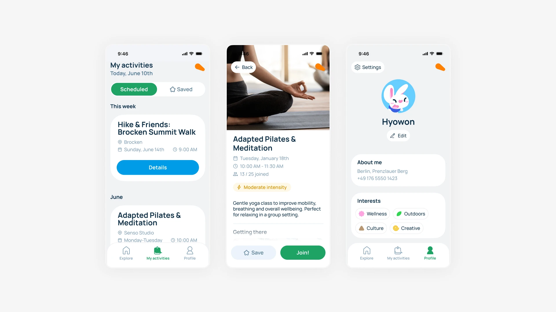
Effort at a glance: Open any activity and its intensity sits right under the when and where. The question we kept hearing, the one no listing answers: can I actually do this?
Inclusive by specification, not by vibe: Body text never drops below 18px, contrast hits AA minimum (mostly AAA), touch targets stay generous, and every string got a plain-language pass.
The calendar we deleted: Early wireframes had a dedicated in-app calendar and map. We killed both. Your phone already has better native versions.
The assistant, honestly: A voice assistant lives in the corner, introduced during onboarding. Born from Carmen's line: "I'm a yapper and I love talking, I just tell the phone what I want." Some users don't want to navigate, they want to ask. A click-through prototype can't fake a conversation, so it stayed a concept, first in line for testing once there's something real to talk to.
Never go alone: We considered a friends section and cut it, a social layer was a second product hiding inside the first. Instead, the moment you join, one tap shares the activity to your WhatsApp contacts, and a join counter means you never show up wondering if you'll be alone.
Effort at a glance: Open any activity and its intensity sits right under the when and where. The question we kept hearing, the one no listing answers: can I actually do this?
Inclusive by specification, not by vibe: Body text never drops below 18px, contrast hits AA minimum (mostly AAA), touch targets stay generous, and every string got a plain-language pass.
The calendar we deleted: Early wireframes had a dedicated in-app calendar and map. We killed both. Your phone already has better native versions.
The assistant, honestly: A voice assistant lives in the corner, introduced during onboarding. Born from Carmen's line: "I'm a yapper and I love talking, I just tell the phone what I want." Some users don't want to navigate, they want to ask. A click-through prototype can't fake a conversation, so it stayed a concept, first in line for testing once there's something real to talk to.
Result
A calm place to find your thing.
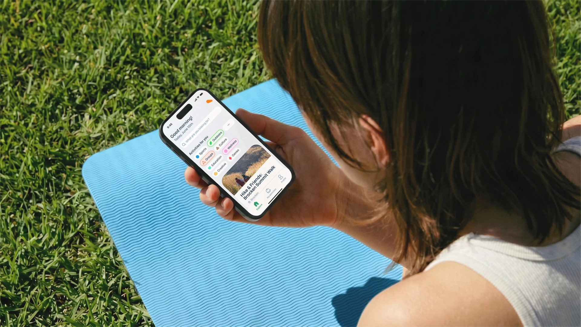
Dinàmics opens with a greeting, not a wall of content. Every activity answers what, when, where, and how demanding. Joining takes two taps. The brand identity and all motion design (save one hand-drawn loop by a talented friend) are my work.
If this shipped, I'd watch one number: how many people come back for a second activity within the first 30 days.
Result
A calm place to find your thing.
Dinàmics opens with a greeting, not a wall of content. Every activity answers what, when, where, and how demanding. Joining takes two taps. The brand identity and all motion design (save one hand-drawn loop by a talented friend) are my work.
If this shipped, I'd watch one number: how many people come back for a second activity within the first 30 days.

Reflection
What I learned.
I thought designing simply was something I already knew how to do. Then I watched people use our prototype, and most of what I'd called intuitive turned out to be habits of mine, not theirs. The best thing this project taught me was to stop trusting my own eyes and go watch someone else's.
Reflection
What I learned.
I thought designing simply was something I already knew how to do. Then I watched people use our prototype, and most of what I'd called intuitive turned out to be habits of mine, not theirs. The best thing this project taught me was to stop trusting my own eyes and go watch someone else's.
Dinàmics shown at the DDI programme presentation, Valencia <3
